AnyDB Chart Cells
Chart cells allow you to visualize numeric data directly inside a record. They are designed for operational use cases where trends, comparisons, and breakdowns need to live next to the underlying data.
AnyDB currently supports:
- Line Charts
- Bar Charts
- Pie Charts
All chart types are configured by referencing other cells that contain array data.
Common Chart Fields
These fields appear across all chart types.
| Field | Description |
|---|---|
| Format | Must be set to Chart to render a chart in the cell. |
| Chart Type | Determines how data is visualized: Line, Bar, or Pie. |
| Chart Title | Title displayed at the top of the chart. |
| Series Name | Label shown in the chart legend for a data series. |
| Series Values | Reference to a cell containing a numeric array. |
| Add Series | Adds an additional data series to the chart (Line and Bar only). |
Axis-Based Chart Fields (Line and Bar)
These fields apply to charts that use an X and Y axis.
| Field | Description |
|---|---|
| X Axis Labels | Reference to a cell containing the category or time labels (array). |
| X Axis Title | Label shown under the horizontal axis. |
| Y Axis Title | Label shown beside the vertical axis. |
| Smoothed | Enables or disables curve smoothing for line charts. |
| Orientation | Bar chart only. Controls vertical or horizontal bars. |
Pie Chart Fields
These fields are specific to pie charts.
| Field | Description |
|---|---|
| Slice Labels | Reference to a cell containing slice names (array). |
| Slice Values | Reference to a cell containing numeric values (array). |
Line Chart
Line charts show trends over time or ordered sequences. They are commonly used for revenue, forecasts, SLAs, and throughput metrics.
Example use case
Monthly Revenue Growth with Actual vs Forecast.
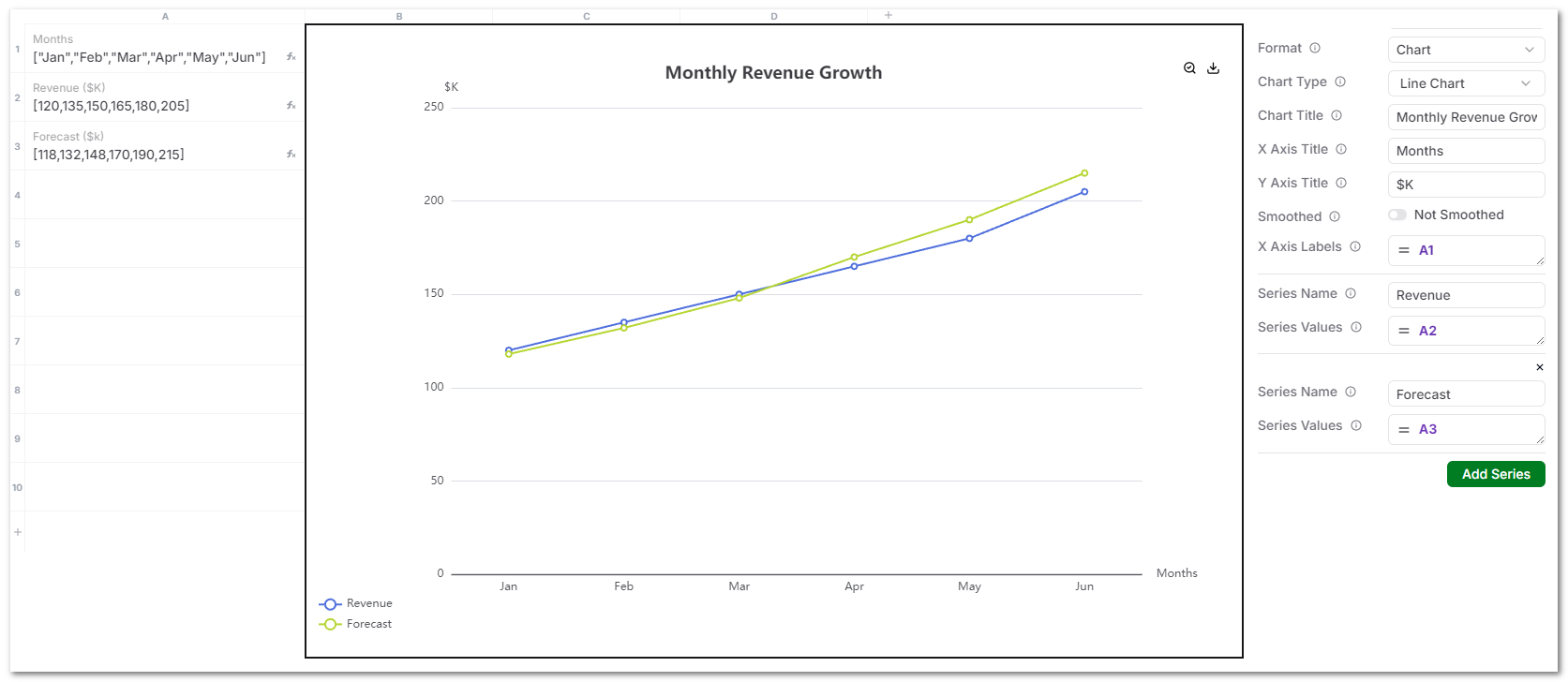
Data setup
X Axis Labels
["Jan","Feb","Mar","Apr","May","Jun"]
Series 1: Revenue ($K)
[120,135,150,165,180,205]
Series 2: Forecast ($K)
[118,132,148,170,190,215]
Chart configuration
- Chart Type: Line Chart
- Chart Title: Monthly Revenue Growth
- X Axis Title: Months
- Y Axis Title: $K
- X Axis Labels:
["Jan","Feb","Mar","Apr","May","Jun"] - Series Values:
- Revenue:
[120,135,150,165,180,205] - Forecast:
[118,132,148,170,190,215]
- Revenue:
Notes
- Multiple series are supported.
- All series must align with the same X Axis Labels.
- Best used for trends and targets.
Bar Chart
Bar charts compare values across categories such as vendors, locations, or departments.
Example use case
Vendor Spend by Quarter.
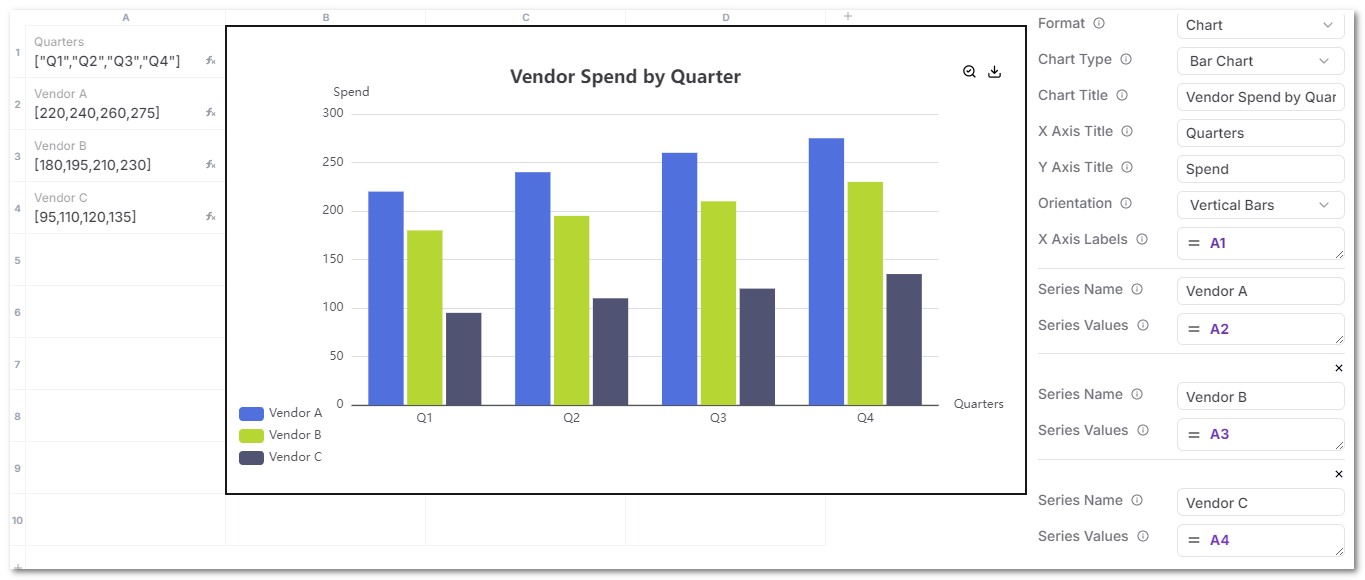
Data setup
X Axis Labels
["Q1","Q2","Q3","Q4"]
Series 1: Vendor A
[220,240,260,275]
Series 2: Vendor B
[180,195,210,230]
Series 3: Vendor C
[95,110,120,135]
Chart configuration
- Chart Type: Bar Chart
- Chart Title: Vendor Spend by Quarter
- X Axis Title: Quarters
- Y Axis Title: Spend
- Orientation: Vertical Bars
- X Axis Labels:
["Q1","Q2","Q3","Q4"] - Series Values:
-
Series Name :
"Vendor A" -
Series Values:
[220,240,260,275] -
Series Name :
"Vendor B" -
Series Values:
[180,195,210,230] -
Series Name :
"Vendor C" -
Series Values:
[95,110,120,135]
-
Notes
- Multiple series render side by side.
- Best for comparisons, not time-based trends.
Pie Chart
Pie charts show proportional breakdowns of a whole.
Example use case
Operational Cost Breakdown.
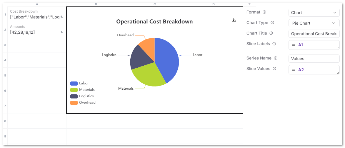
Data setup
Slice Labels
["Labor","Materials","Logistics","Overhead"]
Slice Values
[42,28,18,12]
Chart configuration
- Chart Type: Pie Chart
- Chart Title: Operational Cost Breakdown
- Slice Labels:
["Labor","Materials","Logistics","Overhead"] - Slice Values:
[42,28,18,12]
Notes
- Pie charts support a single series only.
- Keep the number of slices limited for readability.
General requirements
- Source cells must contain arrays.
- Label arrays and value arrays must have matching lengths.
- Charts update automatically when referenced values change.
- Charts are intended for lightweight, inline visualization tied to operational records.
Recommended usage
- Line charts for trends and targets.
- Bar charts for comparisons across entities.
- Pie charts for cost, issue, or resource breakdowns.
Charts are most effective when placed directly on the record they describe or using data from the attached children records.